Wednesday, February 26, 2014

Spock Women and Romeo Men

You can read about the five types of lovers, with thanks to my many creative friends who came up with names for them and Yang Su for data, on the eHarmony blog

The tree of lovers is known as a dendrogram, which we often use in biology for data that might form a tree-like structure -- species, cell lines, or even human tissues. I made this one in Daphne Koller’s biocomputation lab with Alexis Battle and Sara Mostafavi:


Isn’t it remarkable that the same math that describes genetics can also describe online dating? That a single construct lets us understand the heart both biologically and romantically? Statistics, bros -- it's magical.


Notes:
[1] This tree turns out to be much more useful than the tree of lovers because tissues that are close to each other in the tree have similar properties: we can use one brain tissue, for example, to tell us something about gene regulation in the other brain tissues.


Thursday, February 20, 2014

The Power of Correlation Matrices: What do Executions, Cocktails, and Genetic Networks Have in Common?

Correlation matrices are like the lover you just can’t let go: complex and deceitful, but too irresistibly fascinating to abandon. A year ago, when they made me crash Stanford’s supercomputer for the third time, I almost swore them off forever. But I’ve been flirting with them frequently in the past few weeks, and I’d like to write about our reconciliation. First I'll describe what they are; then I'll give five cool examples of why they're useful.


What's a correlation matrix? It’s a square table that describes how variables go up or down together. Here’s an example:


Snowy Outside
Wear a Sweater
Snuggle by Fire
Snowy Outside
-
.8
.7
Wear a Sweater
.8
-
.2
Snuggle by Fire
.7
.2
-


Each entry in the table is the correlation between two variables, a number between -1 and 1 where positive correlations mean that when one variable goes up, the other one tends to as well; negative correlations mean that when one variable goes up, the other tends to go down. In the example above, snow and sweaters are strongly correlated, and snow and snuggling are too, but sweaters and snuggling are less strongly correlated. (Usually I get too warm when snuggled in a sweater, and am less inclined to snuggle the sweatered as well.)  
This is useful because it lets us rapidly see how groups of variables are related and pick out variables that are connected. Here are five brief examples which I may write about in more detail later -- click on the links, the pictures are cool.


-We can look at the 23andMe customers who play 39 different sports, and compute the correlations between sports (full post, in honor of the Olympics, here), and divide sports into groups that tended to be correlated. This lets you see groups of sports that tend to be played by the same people: preppy sports, boring sports, lethal sports, etc.
- We can compute correlations between flavors or ingredients in cocktails, which lets you see which ingredients and flavors tend to be used together, and potentially invent your own cocktails. Here are flavors:


- We can look at the commenters on different New York Times forums, which shows you which New York Times forums tend to share commenters -- the female-dominated forums about fashion, health, and parenting, for example.
- We can look at how levels of gene expression covary in the human body, which can reveal groups of genes that work together: here’s a cluster with immune functions within the blood. (The full tool I built is here.)
- We can compute the correlation matrix for 500 last statements of Death Row inmates (thank you, Texas) where our variables are things like mentioning family or expressing anger:


The darker a square is, the more strongly two variables are correlated: the strongest correlation is between mentioning family and expressing love, which should make you maybe think twice about the people we’re executing.
So one technique can lend insights into everything from alcohol to execution. Amazing, right? What’s the catch? There are at least three problems with correlation matrices [1]:


1. They can lie to you. In the snow example given above, it’s possible that wearing a sweater actually causes you to be less likely to snuggle, all else being equal, but the correlation still appears positive because wearing a sweater is a sign that it’s cold, which is the true cause of snuggling.
2. They can be too big. If I have 10,000 variables, I’m going to need a table that’s 10,000 x 10,000, which is how I crashed Stanford’s supercomputer (I was trying to compute correlations for 10,000 genes in 35 different tissues simultaneously.) This isn’t just a problem because you crash your computer: it’s also because when you compute a table that’s 10,000 by 10,000, you’re computing the values of 50,000,000 variables, and to do that accurately, you need a lot of samples, which you often don’t have. That means that you can’t really trust the values you compute.
3. They can produce knots that are hard to untie. My sports example makes it look like there are eight beautiful groups of sports that separate perfectly:
 
But of course that isn’t really the case: all the sports are somewhat correlated, it’s not like no one who skis plays baseball. But if you actually drew all those correlations, you’d end up with a giant hairball. For example, when I finally got the Stanford supercomputer to compute covariance matrices for my genes, here’s what I found the BRCA1 (breast cancer) gene tended to covary with in breast tissue:


There are 24 genes here with hundreds of links, and it’s very unclear how to make sense of them. To deal with this problem we often try to reduce the number of links, either by ignoring links unless the correlation is very strong or by using more sophisticated techniques.

If you made it this far, thanks for reading! I realize this was a little technical.

Notes: [1] All of which have analogues in love.

Friday, February 14, 2014

Shakespeare Called It: Romeo, Juliet, and 15,298 Genetically Identified Couples

If anyone asked me if I had special plans for Valentine's, I wanted to be able to say "statistics".


So here's another bit of work that I did with a coworker at 23andMe. Using genetic data, you can identify parent-child pairs, and from that you can find "trios" -- a couple and the child they had together. 23andMe's database contains thousands of such trios, which are incredibly useful for studying everything from genetic recombination to inherited disease...to why people reproduce together. Which, it being Valentine's, is what I want to talk about.

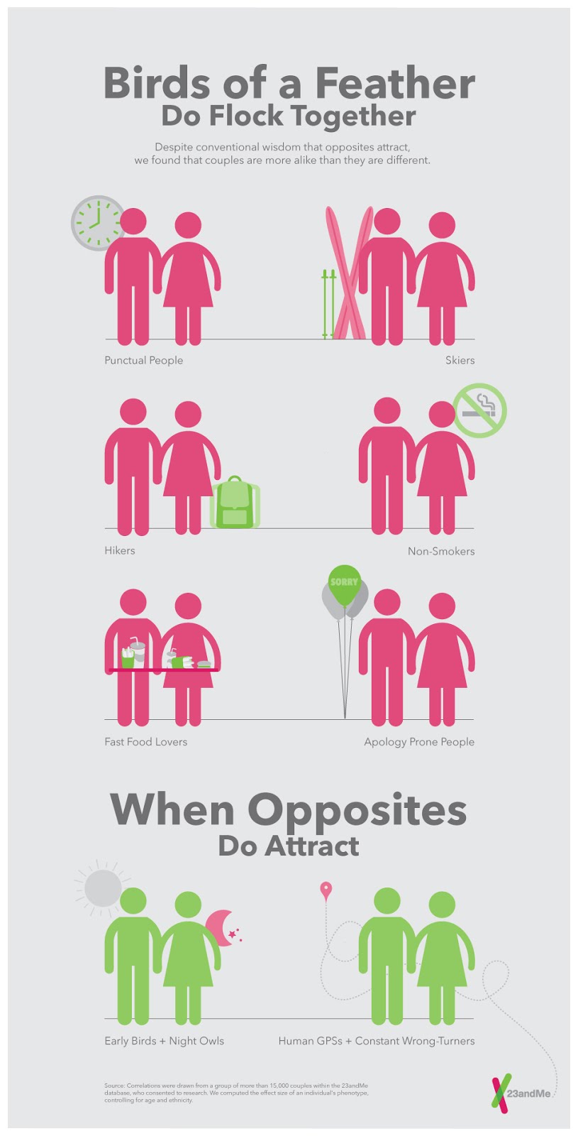
We studied thousands of traits in the trios, and we found that, for about 97% of traits, birds of a feather flock together: your reports for how often you eat drive-through food, how apology prone you are, how punctual you are, are highly correlated with your partner's reports. There are rare exceptions to this -- those with good senses of direction tended to pair with those who lacked one, and morning people tended to pair with night people. (The most famous example of the latter might be Romeo and Juliet: remember when she whines at him to stay in bed -- “It was the nightingale, and not the lark/That pierced the fearful hollow of thine ear”--in spite of the fact that he’s going to DIE?) 23andMe's designers made this beautiful infographic:
But maybe similarity in most traits occurs merely because people of similar age pair together? Whether you have dentures, say, may be highly correlated with whether your partner does, but that’s not because you find matching orthodontia sexy -- it’s just because older people tend to have dentures, and older people tend to pair together. But even when we controlled for similarity in age and race [1], our correlations remained highly significant.


We also checked whether couples with bigger differences in BMI, age, and height tended to report lower life satisfaction, and for age and BMI, they do. (No significant effect for height, which is good, because my dad is a foot taller than my mom.) This isn’t just because if your BMI differs dramatically from your partner’s, it’s a sign that one of you is very skinny or very fat: the negative association remained whether or not we controlled for your BMI and your partner’s BMI.


Does similarity cause couplehood, or couplehood similarity? Maybe your mate is attracted to you because you’re always on time for your dates, and she values punctuality; or maybe you’re initially perpetually late, but when you fall in love she trains you.


Similarly, there are at least three possible explanations for why differences in age and BMI are associated with lower life satisfaction:


1. The straightforward causal one: being with someone much older, younger, skinnier, or fatter makes it harder to do things [2] together, and might make at least one of you insecure, leading to lower life satisfaction.
2. Causality in the other direction: if you’re unsatisfied in your relationship, you don’t do things together (like exercise) and your BMIs diverge. (This doesn’t explain age.)
3. Maybe people usually look for mates similar to themselves in age and BMI, and you only break this social norm if you’re unable to find a mate, which might indicate that you’re less compatible with the person you end up with, or that you have other things going on in your life that make you unhappy. (Thanks to Aaron Kalb for this insight.)


Do all these explanations make reporting correlations a waste of time? I don’t think so, because correlations indicate intriguing directions for more refined surveys or causal experiments. It’s just important to keep correlation and causation unentwined -- unlike yo momma and me.


Happy Valentine's Day to everyone, especially Nat, who is (fortunately) not similar to me at all.


Notes:
[1] We actually did this two different ways. We regressed the value of your trait on the value of your partner’s, including in the regression your age and race; the first coefficient remained significant. We also created 15,000 “fake couples” -- a random man and woman -- combined them with the real couples to create a dataset with 30,000 points. Then we regressed whether you were a real couple (a binary variable) on how much you differed in a trait, and included how different you were in race and sex: the first coefficient remained significant. The first method is probably more intuitive, but both agreed.
[2] What things? Heh heh heh.


Tuesday, February 11, 2014

The Secret to Happiness: Surfing the Internet at 3 AM

There are happy reasons to be up past midnight --star watching, seduction, sentient computer program completion. But I spent my senior year living at the Bridge Peer Counseling Center, where from midnight to 9 AM I took calls from anyone who needed to talk. And while some of those calls came from sleepy people who just wanted to talk about their dreams, in general I grew to suspect that being awake at 3 AM is not correlated with high life satisfaction.


At 23andMe, I confirmed this suspicion, as a post on the company's blog, the Spittoon [1], describes. Customers at 23andMe answer questions about everything from extroversion to earwax -- it's without a doubt the most beautiful dataset I've ever gotten to work with -- and we track what time every answer comes in. So I decided to look at how traits varied as a function of time, and lo and behold...


If you're on a computer answering survey questions at 3 AM, you're probably not a happy bunny. You're also disproportionately likely to suffer from mania. And unsurprisingly...


You're much less likely to have children. You're also more likely to be male [2].


So all of these are pretty terrible (especially the last one!); maybe you should go to bed on time. (And don't give me any arguments about correlation not implying causation; I don't discuss statistics with the sleep-deprived [3].)


Funnily enough, when I started this project, I wasn't looking for sad sleepless people at all: I was looking for happy holiday people. I was lying in bed the day after Christmas feeling full and content, and I thought perhaps I would be able to see a bump in people's BMIs in the weeks after the holidays. Maybe it would be smaller for Jewish customers, or atheists, over Christmas? Would we see a change in political views over 4th of July weekend?


But none of these holiday effects turn up in our data at all. Which drives home a lesson I've learned repeatedly: often, the gold in the data isn’t where you expected it to be. To a statistician, a sad sleepless person is just as good as a happy holiday person, as long as both are statistically anomalous.


Sometimes I take a break from being a statistician to become a human being, however, and so if you ever happen to be sad and sleepless, you can give the Bridge a call at 650-723-3392: they're free, anonymous, and always around. They're also a lot less cranky, on average, now that I'm no longer answering the phone.  

I've been talking to eHarmony's scientists about their data, so we'll return to less depressing topics soon (probably in posts that are both shorter and more frequent.)

Notes: 

[1] Because you have to spit into a tube to get your DNA tested.
[2] One might wonder if all the other effects are simply a result of the gender difference, but that doesn't suffice to explain them.
[3] Obviously, we can't infer causation here. But in general, there's substantial evidence linking sleep deprivation and depression. Addendum: Maria Mateen, a psychology researcher, tells me that abnormal sleep patterns are actually one of the diagnostic criteria for mania, as well as for other psychological disorders.