Tuesday, June 24, 2014
Can You Use Math To Figure Out Whether Someone Wants You?
Yes. (I'm linking out to an external page because this post has interactive visualizations which Blogger won't let me include.)
Tuesday, June 10, 2014
The Statistics of Crisis Counseling
Trigger warning: this post discusses mental health and suicide. Out of respect for the privacy of the callers to the counseling center, it is at times deliberately vague. Huge thanks to the counselors for their patience and thoughtfulness in working with me to make this data available.
My senior year at Stanford I lived at Stanford's Bridge Peer Counseling Center, where from 12 - 9 AM I took calls from anyone who needed to talk. I liked counseling because, like statistics, it let me strip away the noise: a 3 AM call reveals truth usually veiled beneath smalltalk or shyness. It’s a fascinating privilege to hear people explain so bravely and honestly how they work, to see instantly into the clockwork of human nature.
Since February 2011, Bridge counselors have taken nearly one thousand calls [1], and for each call they summarize basic details (while preserving the caller’s anonymity) to keep counselors apprised of important developments. My job was to look at this data. My first year I did the analysis by hand; my second year I wrote a program to do the analysis automatically; and recently I created an online robotic statistician that allows non-programmers to produce reports just by clicking a button. If you are interested in setting something like this up for your own counseling center, or for another purpose, please shoot me an email (emmap1 at alumni.stanford.edu).
So do we learn from our robot? Even the basic statistics are interesting. Try to guess (answers at end):
a) What time of day people call in most frequently
b) How long calls last on average
c) The length of the longest call
d) What percentage of calls come in between midnight and 9 AM
Our statistics also allow us to answer more important questions. An obvious one is why people call: it’s a cliche that every Stanford student is happy, but it’s almost as much of a cliche that students are often secretly unhappy, and nothing makes this more obvious than the Bridge data.
Both men and women call most frequently because of relationships (not necessarily romantic ones), which account for 39% of all calls. But after that their reasons diverge. Women worry more about school: they are more likely to call about academics (29% vs. 16% for men) and stress (34% vs 21%). They are also more likely to call about eating disorders, although this topic is rare in both genders. Men are much more likely to call about gender/sexuality issues (18% vs. 4%); in my experience, this was often related to coming out of the closet.
I think people call the Bridge in part because it’s easy: you’re talking to a fellow student, not a psychiatrist, and a phone call allows anonymity as an appointment doesn’t. Substantiating this, about ¾ of the time, the counselee phones in rather than coming in person. Interestingly, however, the counselor reports feeling more helpful if the counsel occurs face-to-face. This could be because it’s easier to connect with someone, but it could also be because of population differences: people who come in person might be more comfortable talking about their feelings.
I’m often asked how you prepare to be a counselor at the Bridge, and when I tell people that you take two quarter-long courses, they often ask the obvious follow-up: does this really prepare you to counsel people? But according to the data, there aren’t any obvious gaps in the training: I broke down calls by various categories (what the call was about, whether the caller was a grad or an undergrad, etc) and all common types of calls went well.
People also often ask what the suicide calls are like. These calls are rare but obviously pretty important. Suicide callers discuss depression two and a half times as often as callers overall, but they also talk about more common issues: academics, relationships, and stress. Suicide calls are longer, lasting an hour on average (as opposed to 40 minutes for calls overall), and more likely to result in a referral to Stanford’s professional counselors.
This was the only time I’ve attempted to create a robotic statistician that would just report everything interesting about a dataset, and (though I’m perhaps biased) it taught me that human statisticians are still necessary. Statistics is interactive: you ask a dataset a question, get some answer, then ask a follow-up question. So you can’t just hard-code in all the interesting questions a priori, and if you could create a robot that knew enough about people to ask good follow-up questions, you could probably just create a robotic Bridge counselor (I’m working on it) and save yourself a lot of time.
And even if you did manage to create such a compassionate machine, there’d be a limit to what it could learn from this data. Ultimately, if you want to understand why these people are in pain, you need to do more than print out statistics of calls: you need to listen to them. We say the most amazing things at 3 AM, and not just when we’re calling the Bridge -- when we’re falling in love, or getting drunk, or both at once -- and these moments are as precious as they’re mathematically ineffable. Which makes the statistical lens both indispensable and incomplete: everything is mathematical, but mathematics isn’t everything.
Lately I've been thinking a lot about seeing the world through this double lens: seeing, in a spreadsheet, the life that underlies the numbers, and seeing, in a public place, the numbers that underlie the life. Which I find enriches both experiences:
Life beneath numbers: It's easy to get frustrated when you're messing with some matrix math and you forget why the matrices matter -- I think that's why so many students hate linear algebra. I’m a happier statistician when I remember that each row captures part of a person, and I’m a better statistician when I remember that the row fails to capture an enormous number of important things about that person. (If your matrices have nothing to do with human lives, and this bores you, I might suggest finding different matrices.)
Numbers beneath life: People-watching is more fun when you view everyone as a datapoint. I got a bit carried away at the farmer's market the other day and hissed at a happy couple “you are data”. When they lift the restraining order, I'll explain to them that I was trying to comfort them. Because to me it is comforting that our flirtations and day-to-day actions are not just random events that don't matter, but part of a larger pattern. We are not alone in what we do: we move along invisible strings. This was what always drew me to physics: that underlying the chaos of everyday existence were mathematical rules of astonishing beauty [2]. (This is also why I've always loved this scene from V for Vendetta).
I think the power of this idea is one reason that people are so eager to apply mathematical and technological solutions to complex problems. But I also think the Bridge is a reminder of what you can do with no math at all -- I'm proud of our robotic statistician, but the best work done at the Bridge has never been statistical. In the midst of Stanford’s high-tech campus, the Bridge is a place that believes in the comforting power of simple things. They don't offer the bouquet of drugs the chemo or psych wards can, but they have almost as many kinds of tea, which they'll serve to you in chipped mugs from the 70s that proclaim, "Need to talk? Call 24/7!" It's a place where the lights won't turn on and the doors won't lock and the stove smokes ominously when you try to boil water; where the tiny kitchen is filled with semi-edible fossils, and the bookshelves with diaries, from counselors from years before. It is quaint and historic and occasionally helpless in the face of crises that require doctors or psychologists or even the police. But when the dawn light filters into the kitchen as the counselors are making each other tea, there is no more hopeful place to be; and even in the dead of night, it usually works out. There are problems that can only be fixed, it's true, with lasers or nanotechnology; but humans have been suffering since long before such things, and seeking relief from simpler sources: a smile, hot chocolate, a hug.
Answers to quiz:
a) What time of day do people call in most frequently? 9-12 AM (25% of calls)
b) How long do calls last on average? 40 minutes
c) What is the length of the longest call? More than 5 hours
d) What percentage of calls come in between midnight and 9 AM? 31%
Notes:
[1] In fact, they've taken more than that; I haven't worked at the Bridge since August 2013, so my data is at this point out of date.
[2] This isn't, of course, particular to physics and statistics, but those are the fields I know best.
Sunday, May 18, 2014
In Which I Try To Escape Statistics At The Symphony
Lately I've been working on two statistical projects to do with gender and have consequently gotten a little obsessed with gender issues. So I decided to take a break and go to a piano concert -- a pianist who had won the Nobel Prize for piano was playing the most difficult piano piece ever written [1]. Brilliant pianist, beautiful music -- what better way to distract myself from statistics and sexism?
But, haha, joke's on me! I took my seat at the symphony and couldn't help noticing some pronounced gender discrepancies in who played what instrument. I had thrown my program away, so after the concert I went rummaging through the trash in front of a distinguished and disapproving older man -- this is what I'll do for data -- and found a program. For the musicians whose gender I could identify:

But, haha, joke's on me! I took my seat at the symphony and couldn't help noticing some pronounced gender discrepancies in who played what instrument. I had thrown my program away, so after the concert I went rummaging through the trash in front of a distinguished and disapproving older man -- this is what I'll do for data -- and found a program. For the musicians whose gender I could identify:
The differences between the bars are significant (p < .001, chi-2); basically, women play woodwinds and smaller strings, and men play big strings, brass, and percussion [2].
Showing there's a gap between genders is easy; more difficult is, why do we see that gap, and is it a bad thing? In this case, the cause of the gap is somewhat mysterious -- I spent about half a Brahms quartet worrying about it -- because it seems like love of classical music is a pretty deep thing, and to be a professional musician you have to choose your instrument when you're quite young, and we might not expect to see gender discrepancies in which funny looking device you use to express yourself. People often make one of two premature and opposite assumptions when they see a gender gap:
a) The gap isn't bad: it must be due to inherent differences in aptitude or interest. For some instruments, I can think of plausible gender differences in aptitude -- maybe it helps to be tall to play the bass? Maybe having bigger lungs makes it easier to play brass instruments? -- but it's harder to come up with things for the violin. If you want to argue that boys really have an inherent dislike or lack of aptitude for violin, you're going to need to show me the study where you played little babies concerti and counted how often they cooed. Or something.
b) The gap is bad: it must be due to EVIL PATRIARCHAL FORCES. You mad, bro? Yes, we can think of plausible insidious explanations, mostly related to how "manly" an instrument seems. But, again, I want to read the study where boys' parents wouldn't let them play flutes cuz they didn't want them to be sissies, or read the interviews with the former female bass players who got tired of being teased about the massive pieces of wood between their legs.
So I don't think we should assume that gender gaps are or aren't bad. What is inarguable, however, is that the gaps exist and that you can't escape them, even at the symphony. There's an excellent commencement speech entitled "This Is Water", so named for the following anecdote:
There are these two young fish swimming along and they happen to meet an older fish swimming the other way, who nods at them and says "Morning, boys. How's the water?" And the two young fish swim on for a bit, and then eventually one of them looks over at the other and goes "What the hell is water?"
The point being, as the author explains, "that the most obvious, important realities are often the ones that are hardest to see". I think the water metaphor works well for the forces which produce gender discrepancies [3]. We're submerged in this unescapable, ubiquitous sea, and we can't be sure if we're heading where we're heading because we want to or because we've been caught by some little eddy -- did you treat her argument with skepticism because her voice was pitched too high? -- or some huge current -- did she go to science grad school because the American government encouraged many women to in the 1950s? And because these currents always guide us and sometimes drown us, it's worth being mindful of them -- this is water -- and trying to break the surface and take a breath once and a while [4].
This is water to me is a more palatable version of check your privilege, a phrase which has been in vogue of late. The problem with check your privilege, besides the fact that it atom-bombs a debate ("Oh, okay, privilege checked! Now, as I was saying...") is that it isn't just the ones on top who should think about the invisible forces that have gotten them there, but everyone. Yes, the white male should probably keep in mind that our society allows him to be more assertive than most -- but shouldn't the minority female also keep her assertiveness disadvantage in mind when she's negotiating for a raise? Check your privilege should really be check the invisible currents, good and bad, that have carried you here -- this seems to me both more complete and less hostile, although it's harder to Tweet.
I realize I'm a statistician, not a gender theorist, so feel free to send me angry messages. The concert, incidentally, was so good that I briefly forgot all about statistics and just cried; I'm a wimp. Probably it's a girl thing.
If you want to hear the piece played in the concert, here are four options:
Retro
|
Modern
| |
Male Pianist
| ||
Female Pianist
|
Notes:
[1] Arguably. Rachmaninoff's 3rd Piano Concerto has some amazing stories linked to it: one guy went crazy trying to play it, and another guy won a huge international competition held in Russia playing it -- even though he was an American playing Russian music in Russia at the height of the Cold War. The judges were so scared to award him first prize that they asked Krushchev for permission, and Krushchev said, "Is he the best? Then give him first prize!"
[2] You might ask: well, how dyou know this isn't just specific to San Jose? I took a look at my hometown (Washington DC)'s orchestra and the Chicago orchestra for comparison, and it looks like the basic patterns endure -- in Washington, all of the bassists are male and 63% of the violists and violinists are female; in Chicago, 65% of the violists and violinists are female and all 9 bassists are male. I'd love it if someone would do a more systematic review, because it does seem possible to me that San Jose is quite different from larger cities -- in particular, we might see fewer women as the level of the orchestra increases, in the same way that we see few great women chefs even though cooking is a stereotypically female activity. Ping me and we'll write a follow-up post.
[3] Though the original commencement speech makes a very different point.
[4] This is not, of course, unique to gender issues; for example, I could pick out almost all the symphony-goers off the street because, in contrast to the average San Jose resident, they were old, white, and wearing fancy clothing.
Wednesday, May 7, 2014
Mothers, be Good to Your Daughters
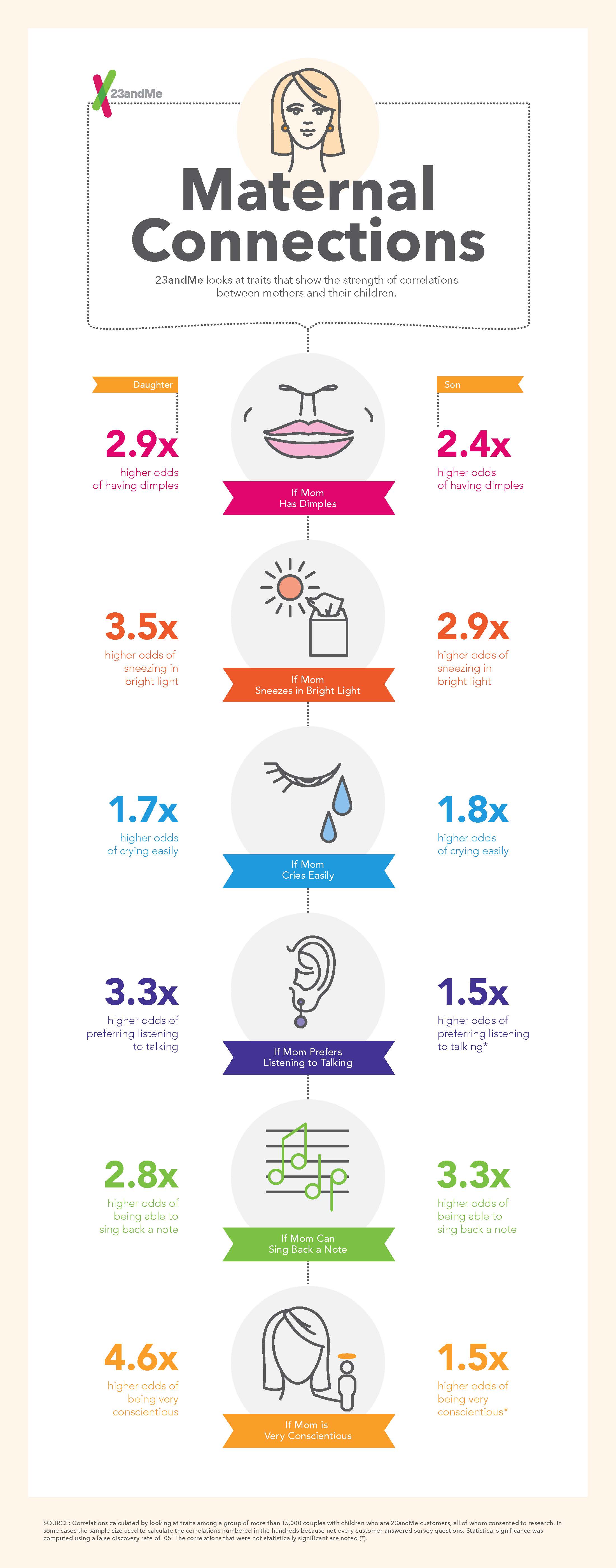
In honor of Mother's Day, at 23andMe we took a look at how our traits correlate with our parents' using 15,000 father-mother-child trios; full post here. We found, of course, that the child's trait tends to be highly correlated with both parents' [1]. Somewhat remarkably, we found no cases (among hundreds of traits) where children show statistically significant tendencies to be different from their parents. The more interesting part, though, is that this effect is stronger for mothers: if you compare the strength of the correlation between the father and the child to the strength of correlation between the mother and the child, the mother's correlation is stronger for most traits. And when we break this down further by the sex of the child, we find it's primarily due to daughters: sons are more influenced by each parent for roughly equal numbers of traits, but daughters favor their mothers. To showcase the quirky ways in which we take after our mothers, 23andMe's designers made this beautiful infographic:

Notes:
[1] I also ran regressions controlling for age and race, which yielded similar results.
Previous research has found that daughters often do take after their mothers -- in BMI, for example, which might in turn be due to maternal influence on diet -- but the reasons for this are probably very complicated. Some of it could be due to the different genetic material we inherit from each parent -- mothers, for example, give us mitochondrial DNA -- but some of it could also be due to the different roles parents play in our lives: mothers spend more time with children, for example.
Happy early Mother's Day to my mom, a force of nature who I'm proud to feel similar to: I don't need statistics to know she's done as much as anyone to get me where I am today.
[1] I also ran regressions controlling for age and race, which yielded similar results.
Saturday, April 12, 2014
How to Fail Repeatedly
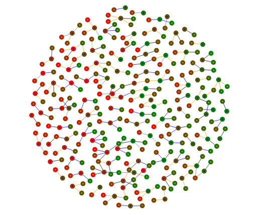
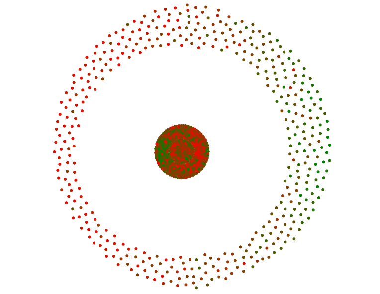
As a followup to the FiveThirtyEight piece, you can find some visualizations of eHarmony couples here. Each circle represents a person on eHarmony, colored according to their value of a trait; two circles are linked if eHarmony’s algorithm matched them together. As the visualization makes clear, similar-colored circles tend to be linked: birds of a feather flock together. Here’s attractiveness, for example; the green ones are the hotties, and they mostly stay on the right, away from the less attractive red people. (This is not a normative comment on skin color. I do not know any green or red people.)
While I was making this, using a language called d3, I took a bunch of screenshots of my progress, which I’ll present as a lesson in failing repeatedly. I started with code to create a visualization with linked circles. But the circles weren’t naturally sorted by color, so the “birds of a feather” phenomenon wasn’t visually obvious, which was the whole point. So I decided I would program in a force that pulled green circles one way and red circles another. This was my first attempt:
And I realized I had forgotten to turn on the force for the red circles. When I did that, I got:
which was a little too Romeo and Juliety: the two factions couldn’t stand each other. So I added exponential decay to the force, so it’d be initially strong (and sort the circles) and then disappear (so they didn’t flee to opposite sides of the frame). Then I decided I wanted to make links appear and disappear when you clicked, depending on who asked out whom. Unfortunately, my first attempt to make links disappear left the old ones lying around like bits of hair:
And, because I don’t really understand d3, I couldn’t figure out how to make the links go away. But I could figure out how to change which nodes they linked to, so I made most of them link to a single node:
which looked more like a dystopian council meeting, or maybe a very strange stoplight, than anything I wanted. But then I figured out how to make the nodes link to the ceiling:
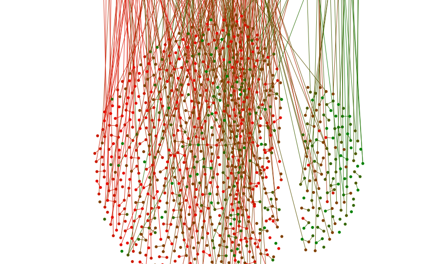
which again wasn’t what I wanted, but allowed me to get what I did: I made all the links start and end in the corner, which effectively made them disappear. I added a little force pulse when you clicked to reorganize the nodes, and you can see the final product here.
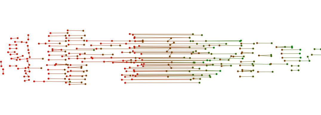
I’m still not completely happy with this, because while it’s pretty, it doesn’t tell you much besides “birds of a feather flock together”. It’s also very hard to tell the difference between girls and guys, and therefore to draw any conclusions about sex differences. Sarah Sterman suggested visually emphasizing sex differences by putting men on one side and women on the other. At first they got too snuggly, making a giant column-o’-love:
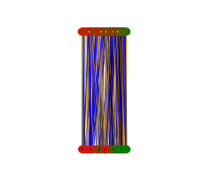
I tried putting them into concentric circles, but that led to weird boundary conditions, so I bumped up the charge to keep them away from each other, and that was a little better:
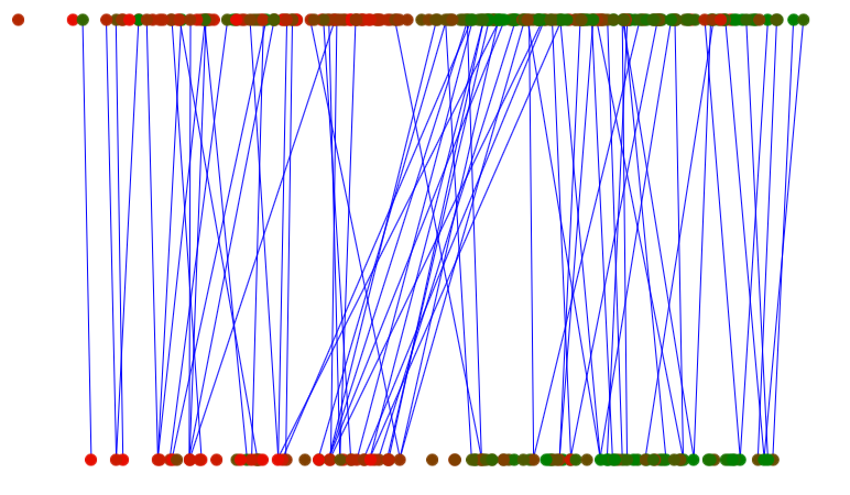
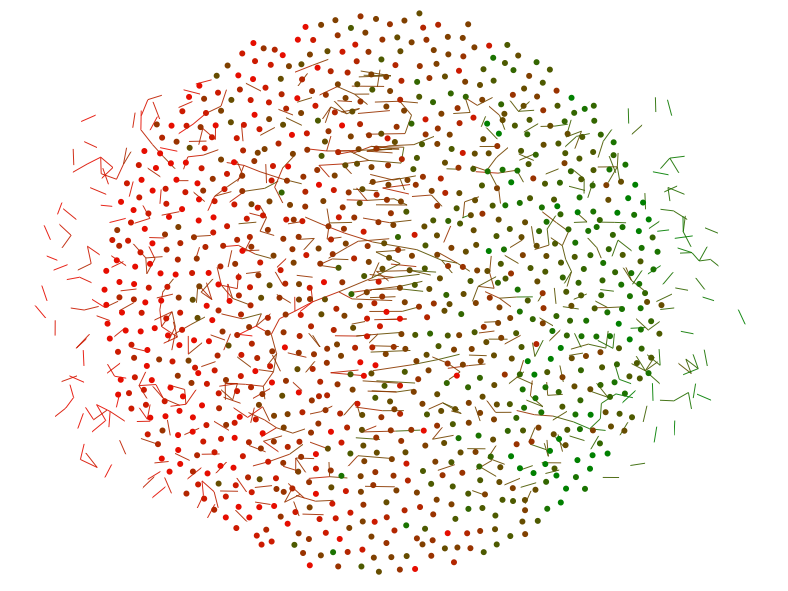
Women are on top, men on bottom: the blue lines indicate cases where the man asked out the woman but she didn’t reciprocate. This visualization is actually more informative than the circle version, because the lines pointing to the right show us that less attractive men get rejected by more attractive women. I think I prefer the bipartite version, but it’s currently a little buggy and a little ugly, so I’m working on it.
My point in telling this story, besides that I suck at d3, is that I think it’s pretty hard to do science or statistics unless you enjoy working with things that are broken, and working with them quite ineptly. I don’t think it’s enough merely to take pleasure in a working product, because 98% of the time I don’t have one. You have to enjoy the careful, painful process of working through the bugs, and be gentle with yourself while you do it -- sleep when you’re tired, don’t beat yourself up over mistakes, have faith in your talent. Here, I’ll make a reference that’s exclusionary towards men -- see how you like it -- it’s like combing long, messy hair: working through the tangles, taking your time, not tearing your hair out.
This isn't unique to science. My mother is an artist, and wakes up at 5 so she can paint eight hours a day -- which I find highly admirable in the abstract but less so when I’m actually sitting for a painting and she won’t let me leave after three hours because my “eyebrow is all wrong”. I’m also not saying that you should be ecstatic every moment you spend debugging, or that you can never lose your temper. One of my coworkers stopped me while I was yelling profanity at my computer yesterday -- I didn’t notice because I had headphones in. Apparently, I curse so frequently that I do it without thinking.
We so often present only our final products: we conceal the cracks and the scaffolding, the blind alleys we ran down. This not only makes us neurotic, in the same way that seeing only everyone’s engagement photos on Facebook makes us lonely -- it also leads to bad science. If you want your scientific story to be too perfect, you’ll conceal the “flaws” that make it true; if you hide the many statistical tests you did to find the few that are significant, you’ll report results that are spurious. I will write more about this later, but in service of keeping things short, I’ll just close with a song about loving imperfections:
'Cause all of me
Loves all of you
Love your curves and all your edges
All your perfect imperfections...
You're judging me. Whatever.
Thanks to Sarah Sterman, Nat Roth, and Maria Mateen.
Note: Unfortunately, the eHarmony data contains no same-sex couples because they do not match same-sex couples on eHarmony's main site; I am looking into ways to get a dataset for same-sex couples as well (for what is currently known, see the original piece.)
Note: Unfortunately, the eHarmony data contains no same-sex couples because they do not match same-sex couples on eHarmony's main site; I am looking into ways to get a dataset for same-sex couples as well (for what is currently known, see the original piece.)
Wednesday, April 2, 2014
The Perilous Power of Parkinson's
Today 23andMe released some statistical analysis I've done on their Parkinson's data, although I'm just the stats nerd on the project -- much more credit goes to the unbelievable organizational effort by many people at 23andMe as well as other organizations like the Michael J. Fox Foundation, and the 10,000(!) Parkinson's patients who provided their data.
On the one hand, I like helping out with this research because, in contrast to my research on sex or Shakespeare, it has the potential to save lives. On the other hand, it's the most high-pressure work I've ever done, because if I mess it up, people may actually die. So I literally did all my analysis twice -- completely rewrote the code -- because I was scared. At least I'm confident it's correct now.
But, in general, I am frightened by my fallibility. Each analysis I do relies on hundreds or thousands of lines of code, and if I do one analysis a month, it seems arrogant to the point of self-delusion to think that I will never in my career write a line that contains a serious error. And conceptual errors are even harder to spot than coding ones. So I see mistakes in published work in fields from economics to computational biology, and it's hard for me to think that these mistakes don't contribute to the low reproducibility of results even in cases, like cancer research, where people really do die if you get stuff wrong.
There is a more positive way to put this. Over the summer I was at a Coursera recruiting event where Andrew Ng, one of the founders, addressed a crowd of potential employees:
"100,000 people might do a Coursera assignment. If it takes each of them 4 hours on average, and you do a bad job, you've wasted 91 years of human life, so you've basically killed someone--"
"What Andrew's trying to say," Daphne Koller, the other co-founder, burst in, "is that working here gives you huge power to affect people's lives for the better."
If people die if you get stuff wrong, it means they live if you get stuff right. Refusing to wield this power because you fear the responsibility is not really an option. And some organizations -- the airline industry, say -- really have mastered the art of (pretty much) never getting things wrong. But scientists and statisticians clearly haven't, so I'd welcome any tricks you have for making work/code reliable and reproducible. Write me a comment below (you don't have to be a scientist or statistician!) or shoot me an email at emmap1 at alumni dot stanford dot edu.
And apologies for the doom and gloom post -- we'll get back to love and sex next week, I promise.
Sunday, March 9, 2014
Chasing Gender Equality in Education
In honor of International Women’s Day, Coursera released an analysis of gender equality in education which I began as an intern last summer, using their unique dataset which includes data for millions of women around the world.
Studying statistics has made me very interested in gender issues, and the reason is simple. If you're a statistician, studying gender is like kicking a puppy down the stairs: an unfairly easy way to see something interesting. And, depending on the dataset and the cuteness of the puppy, very depressing. It’s hard not to get angry when you see the numbers scroll down your screen, laying out basic inequities in black and white [1].
So it was an honor to work on this project with Tom and the other members of the data analytics team: even though I was the only girl on the team, they never made feel that way. If we ever do achieve gender parity, it will be in part because of guys like them -- and also because of the equally intimidating women Coursera’s managed to hire. On Friday night Tom and I were trying to finish up this analysis in Coursera’s offices, and it was getting near 10 and the lights kept turning off so we were coding in the dark and eating tortilla chips and seaweed for dinner [2]. And I was hunched over on the floor trying to debug my code and thinking, huh, I look really cool right now.
But then I realized: I was happy. This is what I want to be doing.
With thanks to Nick Eriksson, Jacob Steinhardt, and Nat Roth for insights and edits, and to everyone at Coursera.
With thanks to Nick Eriksson, Jacob Steinhardt, and Nat Roth for insights and edits, and to everyone at Coursera.
Notes:
[1] There are, of course, many other factors -- race and age being two -- which reliably produce profound differences between people, and these are also important to study. Unfortunately, these traits are often harder to infer: in many datasets, you can figure out someone’s gender from their name, but you can’t really do that for race and age.
[2] To avoid giving a false impression: this is not how people at Coursera usually work. In fact, everyone else I saw at the office was there for the company’s weekly happy hour.
Subscribe to:
Posts (Atom)