Friday, January 17, 2014

The Statistics of Love, and the Love of Statistics


With thanks to Yang Su and Andrew Chou for data.

Today we’ll analyze a million eHarmony couples, each a male and a female [1] matched by eHarmony’s algorithm. We know everything from how passionate, intelligent, and ambitious our lovers claim to be to how much they drink and smoke to their preferences in other people and (the good part) whether the male contacted the female within a week and vice versa. This is a total of 204 facts about each couple, making the data too rich and complex to understand in a single analysis: consider this a first date with the data.

Actually, this metaphor’s appropriate: though sipping Amarone by candlelight bears little resemblance to running regressions, you’d be surprised at the similarities between first meeting a dataset and first meeting a date. You’re given the opportunity to discover wonderful secrets about the creature in front of you, if you can manage a paradox of patience and pushiness. On the one hand, you have to be gentle: you have to listen to what they’re trying to tell you, you can’t force your preconceptions on them. On the other, you have to be bold: you have to ask the questions you’re interested in, and follow your heart about what matters. In both dating and data, all the technical virtuosity in the world -- insincere flirtation, unnecessary real analysis -- won’t get you anywhere without empathy and passion. And there are raunchier parallels as well: both may require you to stay up late, strip away outer layers, and bring a computer cord to bed [2].

Now that I’ve convinced you of my ignorance of both love and statistics, let’s talk about the statistics of love. I’m going to focus on a simple question: how are men and women different?

Who’s pickier? Complicated. Short answer: women claim to be pickier, eHarmony ignores them, and then they take what they’re given anyway.

Women express stronger preferences about their date along every dimension. Below, I rank all preferences sorted by how much more important they were to women than men (on a scale of 1-6).

Trait
Average Strength of Preference (women)
Average Strength of Preference (men)
Women - Men
Height
4.7
3.0
1.7
Income
4.6
3.0
1.6
Education
4.8
3.6
1.2
Drinking level
4.5
3.5
1.0
Religion
4.2
3.3
0.9
Ethnicity
4.6
3.8
0.8
Smoking Level
5.4
4.7
0.7
Age
4.8
4.2
0.6
Distance
4.9
4.6
0.3
So the women express stronger preferences, which apparently annoys eHarmony’s matching algorithm: 69% of men have their preferences satisfied by the algorithm’s matches, whereas only 60% of women do. (Of course, I’m sure eHarmony doesn’t discriminate against women; it’s just harder to satisfy them.) Here’s the weird part: even though they’re less often satisfied, women still contact their matches at higher rates. I guess we’re just inured to disappointment.
Alternately, it could be because there are more women than men on eHarmony: roughly 53% of the unique ids are female, which is more dramatic than the skew in acceptance rates (51% to 49%). So given their numbers advantage, guys may actually be selling themselves slightly short.

How do men and women describe themselves differently?

We can plot the frequency with which men and women use certain adjectives to describe themselves. Words above the line are more commonly used by men, and words below the line by women.
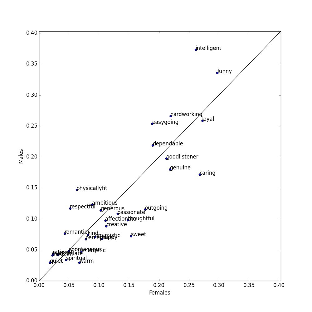
Words used more by men
Words used more by women
1. Intelligent (37.3%  vs 26.1%)
1. Caring (26.7% vs 17.2%)
2. Physically fit (14.7% vs. 6.3%)
2. Sweet (15.3% vs 7.2%)
3. Easygoing (25.4% vs 18.9%)
3. Outgoing (17.7% vs 11.5%)
4. Respectful (11.7% vs 5.2%)
4. Thoughtful (26.8% vs 17.1%)
5. Hardworking (11.7% vs 5.2%)
5. Genuine (21.9% vs 18.0%)

You might expect that the adjectives people use to describe themselves are the ones likely to get them responses [3]. This turns out not to be the case: there’s no significant correlation between how often a gender uses an adjective and how often people who use that adjective get responses. In general, the adjectives you use don’t seem to make a big difference (come on -- it’s not your personality I’m interested in) but there are a few notable exceptions that I’ll disclose for the benefit of your love lives:
Sexier for women
Both “physically fit” and “sweet” are more likely to get you a date as a woman than a man. But women use “physically fit” about 8% less than men, and use “sweet” about 8% more.
Sexier for men
“Spiritual” is about 8% more likely to get you a date as a man than a woman.
Bad for both
“Quiet”. Don’t use this word. It’s the least sexy for both sexes, and particularly bad for men.
Overused
Both sexes use “intelligent” and “funny” frequently, but neither word is particularly good at getting them dates. My guess would be that this is because they’re generic.


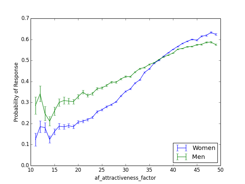
Of course, men and women differ in many other ways in terms of what they want in a mate. Attractiveness matters more for women; on the x-axis I plot attractiveness for both men and women, and on the y-axis how likely they are to get a response. 

And age has pretty much opposite effects.
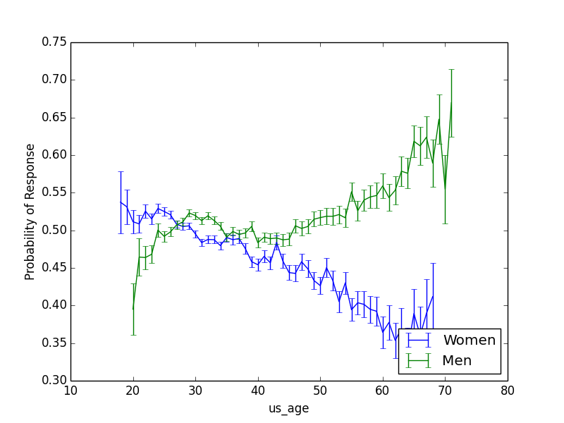
I thought older women might do worse in part because they outnumbered older men (because women live longer). But in fact the reverse is true: as the age of users increases, the fraction of females decreases, and the majority of people over 60 on the site are males. It’s just really hard to get a date on a dating site if you’re an older woman: this a depressing phenomenon has been thoroughly explored in this lovely post.

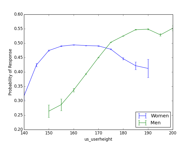
For men, being taller is pretty much always better, but women over 5’ 7” should consider kneeling.
Other interesting sex differences:  

Marital status: For a man, being divorced is slightly less sexy than being widowed, but for a woman, being widowed is way worse. A widowed man has a 54% chance of getting a response; a widowed woman, 37%.

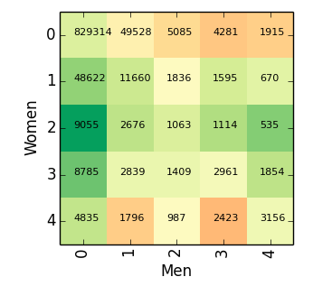
Smoking: Men's sexiness decreases with the amount they smoke, but women are actually most likely to be asked out if they say they smoke “occasionally”. I was taken aback by this, and thought it might just be because male smokers get paired with female smokers, and male smokers find it harder to get a date, so they just ask everyone out. But, no -- men are more likely to ask out women who smoke regardless of whether they themselves do [4].  In the plot below, the color of a square indicates how likely the man is to ask the woman out (green = more likely), and the position indicates how much the man and woman smoke. (The number is just how many datapoints we have.) You can see that the row labeled “2” for women, indicating women who smoke "occasionally", beats all the other rows regardless of how much the man smokes.


Keep an eye out for the next eHarmony post, in which we’ll examine whether opposites really attract and learn about the four types of lovers. This is such a great dataset that you could keep going all night...but one should leave something for the second date.
Notes:
[1] Yes, I also think it’s weird and bad that the dataset includes only heterosexual couples. Let me know if you have a good same-sex dataset.
[2] Jokes!
[3] Because that’s the true parallel between love and statistics: in both, you bend the truth to get what you want. 
[4] All this proves is that women have better taste than men; please please please don’t smoke.

Thursday, December 19, 2013

In which I use regression to cope with my childhood insecurities

Whenever I got too cocky as a child, my mother used to threaten me with “regression to the mean”.


“You think you’re so smart,” she would say. “But statistically, smart parents tend to have children who are dumber than they are. So you’d better listen to me.”


Clearly this was scarring, because I then went to college and took a bunch of statistics classes in an effort to understand this fearsome “regression to the mean”. It turned out to be a foe as subtle as it was important: a recent article in Nature cited it as one of the 20 most critical phenomena for policy-makers to understand.  I will first explain the concept, and then two particularly seductive perversions of it [1]. It is entirely possible that my understanding is still flawed, in which case you should comment or shoot me an email.


What is regression to the mean?


My mother was right: exceptional parents tend to have less exceptional children. Sir Francis Galton was first to notice that tall parents tended to have children who were shorter than they were, and short parents tended to have children who were taller. This isn’t just an effect with parents and children. Mutual funds that do very well one year tend to do worse the next year. If we look at the 100 National Basketball Association players who scored the most points in 2012, 64% of them scored fewer points in 2013. And this is true no matter what metric we look at:


If we rank players by...
Probability a top-100 player got worse in 2013:
Defensive rebounds per game
64%
3-pointers per game
63%
Assists per game
59%
Steals per game
67%


Doing well in 2012 isn’t causing the athletes to do worse in 2013: as I’ll explain, this is merely a statistical illusion. So regression to the mean inspires a lot of really stupid sports articles: the Sports Illustrated cover jinx refers to the myth that appearing on the front cover of Sports Illustrated is bad luck for an athlete because these athletes often suffer a drop in performance, but this is only a manifestation of regression to the mean, not a causal effect of the cover story. Medical trials provide a slightly more consequential example: if you give a drug to people in the midst of severe depression and check on them two weeks later, they’ll usually be doing somewhat better, but that’s not necessarily the causal effect of your drug:  they would also probably have improved if you had done nothing.


Why does this occur? 

Scoring baskets is a combination of skill and luck. A basketball player who scores an exceptional number of baskets in 2012 is likely more skillful than the average player, but he’s also likely more lucky. His skill will persist from season to season, but his luck won’t, so if he got very lucky in 2012, he’s likely to be less lucky--and do worse--in 2013. Regression to the mean emerges whenever we have this combination of signal and randomness: the signal will persist, but the randomness will not.


We can describe this combination of signal and randomness more mathematically. Regression to the mean occurs whenever there is imperfect correlation between two variables: they don’t lie along a perfectly straight line (see end for a longer explanation of correlation [2]). Here are some correlations: 


(The above data is hypothetical.) Perfect correlations, of -1 or 1, are pretty much impossible in real data, which means that almost any two variables will exhibit regression to the mean. Let x be how good-looking you are and y be how many drinks you get bought at a bar. We'll express x and y in terms of standard deviations--so if you were two standard deviations better looking than the average person (like me, on a bad day), x would be two. (We often refer to data not in terms of its actual value, but in terms of its distance from the average in standard deviations, because that gives us a sense of how rare it is: this is sometimes called z-scoring, see end for a brief explanation [3]). 

x and y are probably positively correlated here [4]--let’s say the correlation r is .5. If you want to fit a straight line to the data--we call that “linear regression” or “the only technique an economist knows”--predicting y from x is actually incredibly simple: y=r*x [5]. (This is only true because x and y are z-scored -- another nice thing about z-scoring data -- in general, the formula is a bit more complex.) So if you were two standard deviations better looking than the average person, r being .5, linear regression would predict that you get one standard deviation more drinks than the average person. The important point here is that two is less than one: the number of drinks you get is less extreme than your hotness, you have regressed to the mean. 

Because the gap between x and r*x gets bigger as x gets more extreme, the gap between x and our predicted value of y gets bigger as x gets more extreme--more regression to the mean. (On the other hand, if x is close to its mean, the scatter in y means that y will actually tend to lie farther from the mean than x does: very average parents should have more extraordinary children, which we could maybe call the Dursley-Harry Potter effect.)


This definition makes regression to the mean both more and and less powerful than is often supposed, which brings me to...

The two seductive misconceptions


1. Because the examples given of regression to the mean are often of parents and children, many people think it has something to do with genetics and biology; alternately, they hear about depressed people becoming better on second measurement and think it is just a property of repeated measurements. But regression to the mean has nothing to do with sex or psych or any of those icky things: it is a mathematical property of any two imperfectly correlated variables, and there need be no causal relationship between the two.


2. The second seductive misconception is my favorite, because it means my mom was only half right. Regression to the mean is limited in two important ways which I’ll illustrate by example. First, regression assumes our data lies along a straight line. But consider the case where x describes the performance of a royal courtier on his first etiquette exam, and y describes the performance on his second. We might expect to see something like the left plot, where a straight line fits the data well. Now imagine the exam proctor is Henry VIII, so that between the first exam and the second, every courtier who’s below average is beheaded, and every courtier who’s above average is given the answer sheet. In that case, everyone either gets a perfect score or a zero (right plot), and a straight line no longer fits the data very well. (Both plots are z-scored so the mean is zero and the standard deviation is 1.)


Even though both datasets have roughly the same correlation, and thus the same degree of “regression to the mean”, these concepts are only meaningful to the extent that a straight line actually fits the data. Intuitively, in the second plot, the y-values are more extreme than the x-values: certainly the headless courtiers would think so.


But let’s ignore this problem and assume that a straight line does fit the data well. All that means is that y is fewer standard deviations from the mean than is x. But if the standard deviation of y is much greater than that of x, the predicted values of y may still be “more extreme” in an absolute sense, even if they’re not in a z-scored one. Below I calculate the average score of state Congressional representatives on a conservative-liberal scale, according to these bros, for the 97th Congress (beginning in 1981) and the 111th Congress (beginning in 2009). Negative is more liberal.


Unsurprisingly, there’s a strong correlation, with r=.57. But this correlation is still less than 1, so we would expect this dataset to exhibit regression to the mean, and indeed it does: when we look at the 10 most extreme liberal states in 1981, 7 become less liberal (as measured by z-score) in 2009 (the exceptions are Massachusetts, Rhode Island, and New York). But our incredibly harmonious political system has become more polarized since the 1980s, and so the standard deviation in y is nearly 50% greater than the standard deviation in x. So while this dataset technically exhibits regression to the mean (in the z-scored sense), 38 of the 50 states are actually farther from the mean, in an absolute sense, in 2009 than they were in 1981: they became more extreme (red dots) not less extreme (blue dots). And since x and y are measured on the same scale, we probably care about the absolute sense. 

Mind blown! In summary: if the scatter in your data increases, regression to the mean might not mean much. To return to my argument with my mother, one might imagine that smart parents make their children play chess, and dumb parents make their children play football, and that chess and football have such profoundly opposite effects on intelligence that the children’s IQs range from 50 to 150 while their parents’ range only from 90 to 110. The z-scored predictions for the children’s IQs will be less extreme than their parents’, but the absolute predictions may be much more extreme.

Which is to say that my mother is not necessarily right. But given that I’ve spent the last 17 years worrying about an argument she’s long since forgotten, you can draw your own conclusions [6].


With thanks to Shengwu Li and Nat Roth for insights.

Notes:
[1] My high school physics teacher used to shield us from tempting mistakes by saying “Don't give in to this seduction! Because then you'll be pregnant with bad ideas.”
[2] Correlation is a number between -1 and 1 which measures how consistently an increase in one variable is associated with an increase in the other. Positive correlations indicate that an increase in one variable corresponds to an increase in the other; negative correlations indicate that an increase in one variable corresponds to a decrease in the other; zero correlation indicates no relationship.
[3] Standard deviation is a measure of how spread out the data is: if data follows a bell curve, which data often roughly does, 68% of the datapoints will be within 1 standard deviation of the average, 95% within 2, and 99.7% within 3, a fact referred to, creatively, as the “68-95-99.7 rule”. Standard deviation is useful because it lets us refer not to the actual value of a datapoint, but to its distance from the mean in standard deviations--this is called the “z-score”, and gives us a rough sense of how “rare” a datapoint is. IQ tests, for example, often have a mean of 100 and a standard deviation of 15, which means that someone with an IQ of 145 has a z-scored IQ of 3: this is a good way to insult them, although if they actually have an IQ of 145 they will probably figure it out pretty quickly.
[4] Except at really sad places like MIT bars, where there’s so little variation in x that the correlation coefficient becomes undefined.
[5] For those who know a little bit about regression, here’s the weird thing you might want to think about: we could also predict x from y, in which case we get x=ry, not y=rx. Which of these lines is “correct” and why is this not a contradiction?
[6] In case it is not apparent, I like my mother.